Author: Rahul, Consultant at Fusion Practices
Being a full stack developer is not an easy task! It has been over four years now, and front end still dazzles me, like it did when I first entered the field. As a result of my work, I was working on Microsoft Power Platform which has the following four tools:
- Power Apps
- Power Automate
- Power BI
- Power Virtual agents
This blog will specifically deal with Power Apps. It is a low code/no code solution to design and develop web apps. Though many properties are available as an in-built solution, there is a lot of scope for having many UI functionalities as a default within the system. One of them being Error chips. The last framework I worked on was Vuetify, which is Google material framework for Vue.js. It has a concept of chips, which are small boxes that can be positioned anywhere on the screen. They can either disappear after a certain time or can be removed manually by clicking on the cancel icon of box.
However, many times, the problem that arises is that the boxes were too inconspicuous. There is a need for a more prominent way of displaying error message or success message boxes rather than the built-in Notify method which displays a full length, yet a very light notification box at the top of the screen:
Notify () – Vanilla notification that is grey in colour, signifies info segment of messages.

Notify (“Success Message”, Success) – Notifications specifically for success messages that should appear after successful completion of an operation, say Update, Add, or return of 200 status code from an API response.

Notify (“This is a standard notification”, Error) – Notifications for displaying error messages like an operation not being completed successful, an API being down and returning status code 500.

The problem that arises with these notifications is that the user has no control over them, nor can they decide the duration they appear on screen. Moreover, the minimalist nature of their appearance does not pass for an appealing or attention-grabbing UI.
Hence, I thought of building a reusable component to tackle this and in the journey create a component for everyone to use it.
Following are the steps to create a component in PowerApps for error chips:
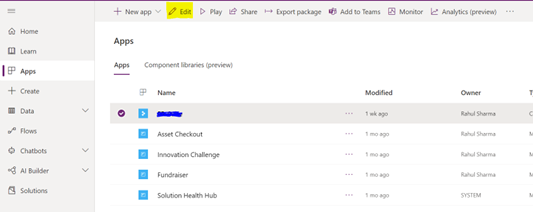
Step 1: Go to make.powerapps.com and open any of your app in edit mode. I ask this because creating error chips supplements if you have an operation to perform on data, which can either pass or fail for us to display an error message: (please look for the yellow highlighter)
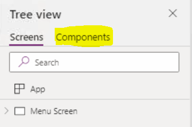
Step 2: What opens is your canvas app. Now to go over to the Components section in the tree view
Step 3: Create a component called Success Box with following elements and input property
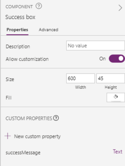
Elements include:
- Check icon names icon_success with following dimensions:
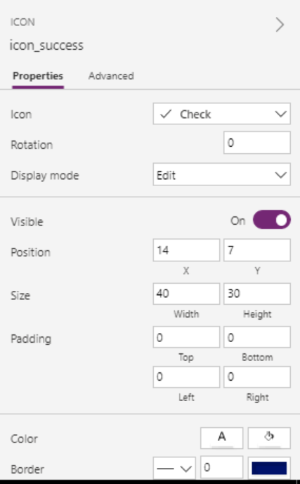
- Text element for message with following dimensions:
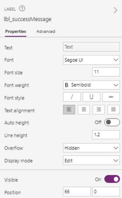
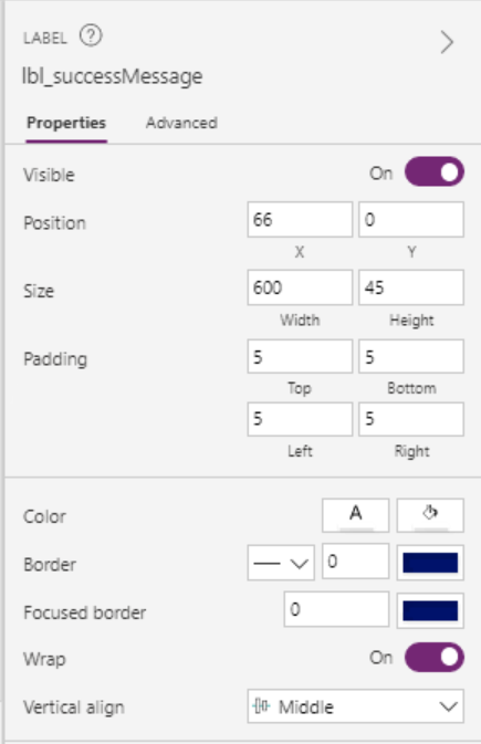
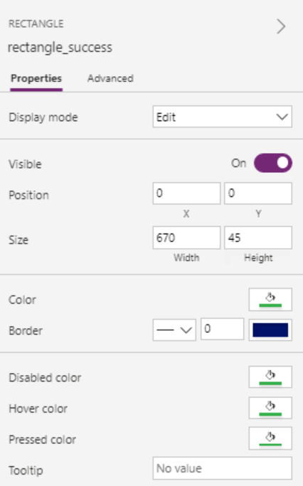
- A rectangle to wrap icon and label
- Input property: Add an input property named “successMessage”, this will then be populated with a variable for displaying success message.
- Select the label’s (lbl_sucessMessage) text property and set it to ‘Success Box’.successMessage
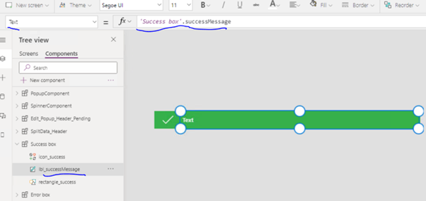
Step 4: After including the above elements, the component should look something like this

Step 5: On the same lines create another component for error box. If you follow the exact steps that were used to create success box with few changes like icon and colour, error box should look this

Step 6: Go back to the Screens tab and add both the components in any screen that has operations being performed. Select Custom, locate your component and add them.
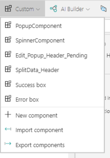
Step 7: Both components are part of the screen now. You will see pending being postfixed at end, it’s because these components will be used in more than one screen, so to distinguish them screen to screen, I postfix them with screen name. I am following Microsoft’s standard for PowerApps coding.

Step 8: In the OnVisible property, the screen in which these components are added, add the following statements

Step 9: Insert a timer and set their properties to below values

Step 10: Go to component_successBox_pending component and set its successMessage (input property) to successMessage variable. This will display any message that we set in successMessage variable.
Step 11: Do the same with component_errorBox_pending, set its properties with error-based variables.
Step 12: One would thereby have a flow that calls an API and then returns success or error Message like this:
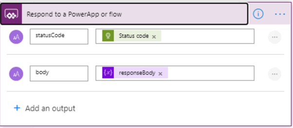
If statusCode is 200, I do:

And when API fails, I set

And error chip looks like this:

Hope this helps everyone who is trying to create a reusable chip component.


